Guide · Event Branding
15 event branding ideas and examples for impactful experiences.
A practical, visual guide to event branding — from start/finish gantries to environmental graphics and sponsor integration. Every example below is real work built in-house by our Nairobi studio.
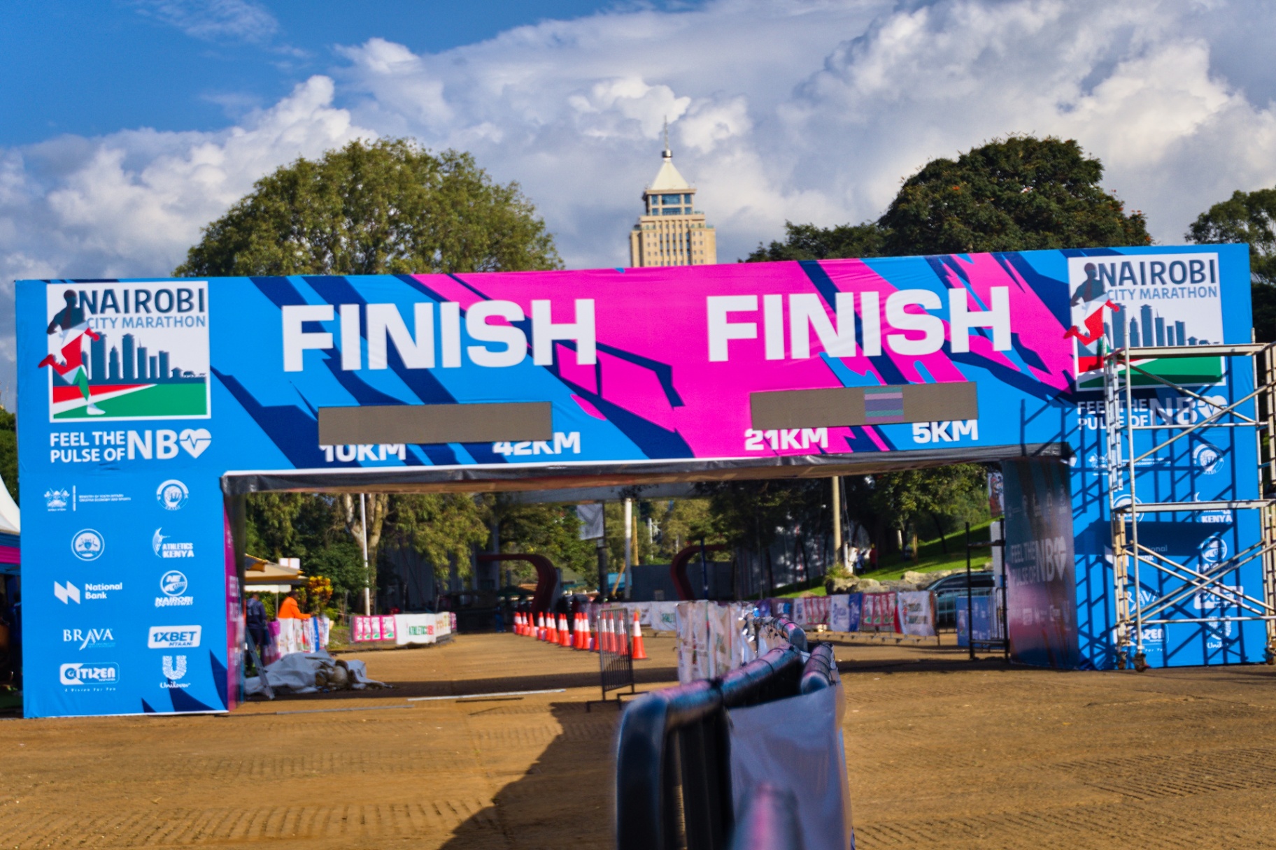
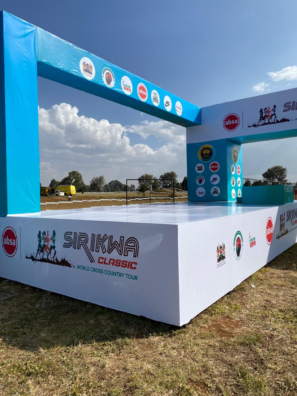
Idea 01
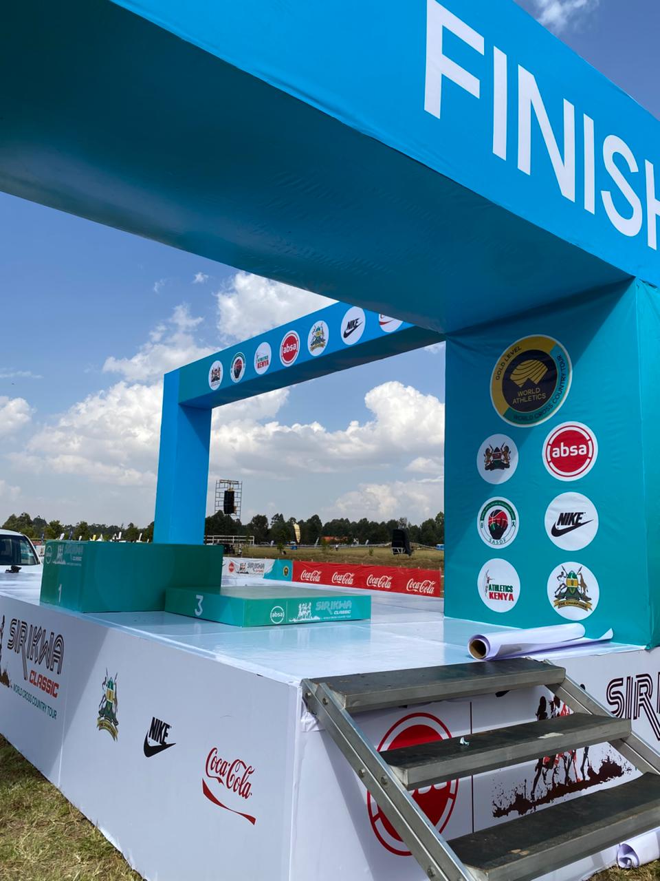
A signature start / finish gantry
The gantry is the single most photographed object at any race or activation. Treat it as a portrait frame — heavy structure, clean brand mark, and a colour block that reads from 100m away.
Idea 02
Environmental graphics that guide the walk
Wayfinding is branding. Floor decals, pylon flags, hanging banners and directional totems keep guests oriented while stitching the identity into every corner of the venue.
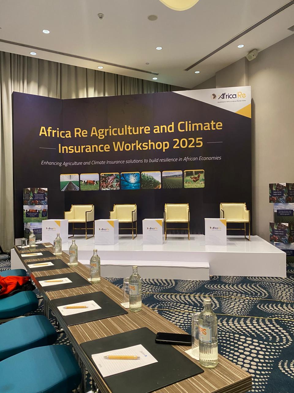
Idea 03
A stage backdrop built as one object
Fabricate the stage backdrop as one continuous graphic — logo lockup, kicker line and sponsor bar all typeset together — instead of stitched banners. It reads as a designed object on camera, not a booth.
Idea 04
Sponsor integration without the clutter
Give sponsors a system, not a scramble. Fixed tier positions, a shared grid, and consistent lockup sizes turn a sponsor wall from noise into a designed panel — and sponsors get better photography out of it.
Idea 05
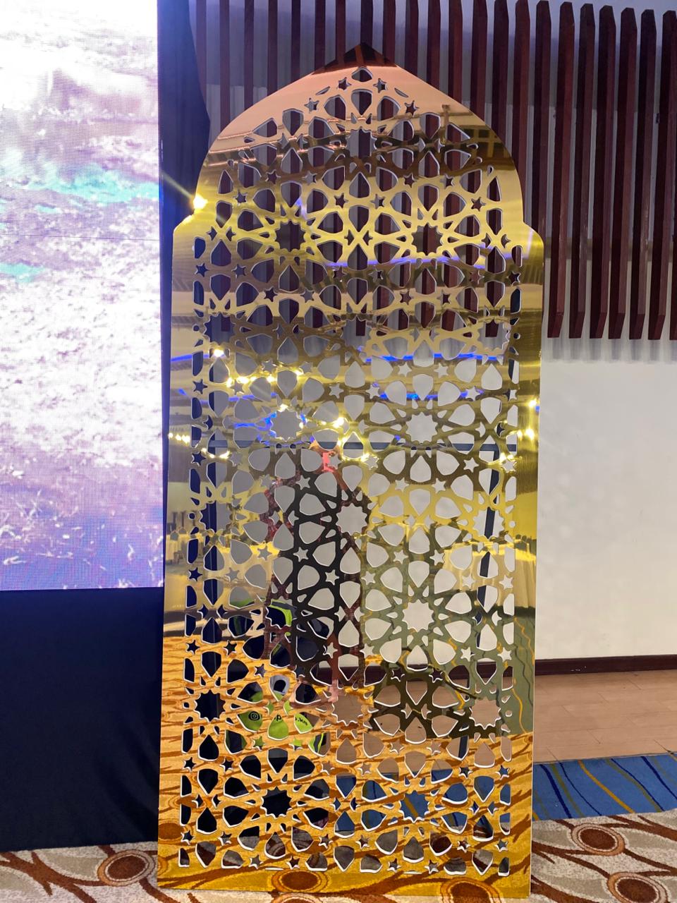
A monumental entrance arch
The arch is the first frame of the experience. Scale it up, light it from below, and let the identity carry through the structure itself — colour, texture, form.
Idea 06
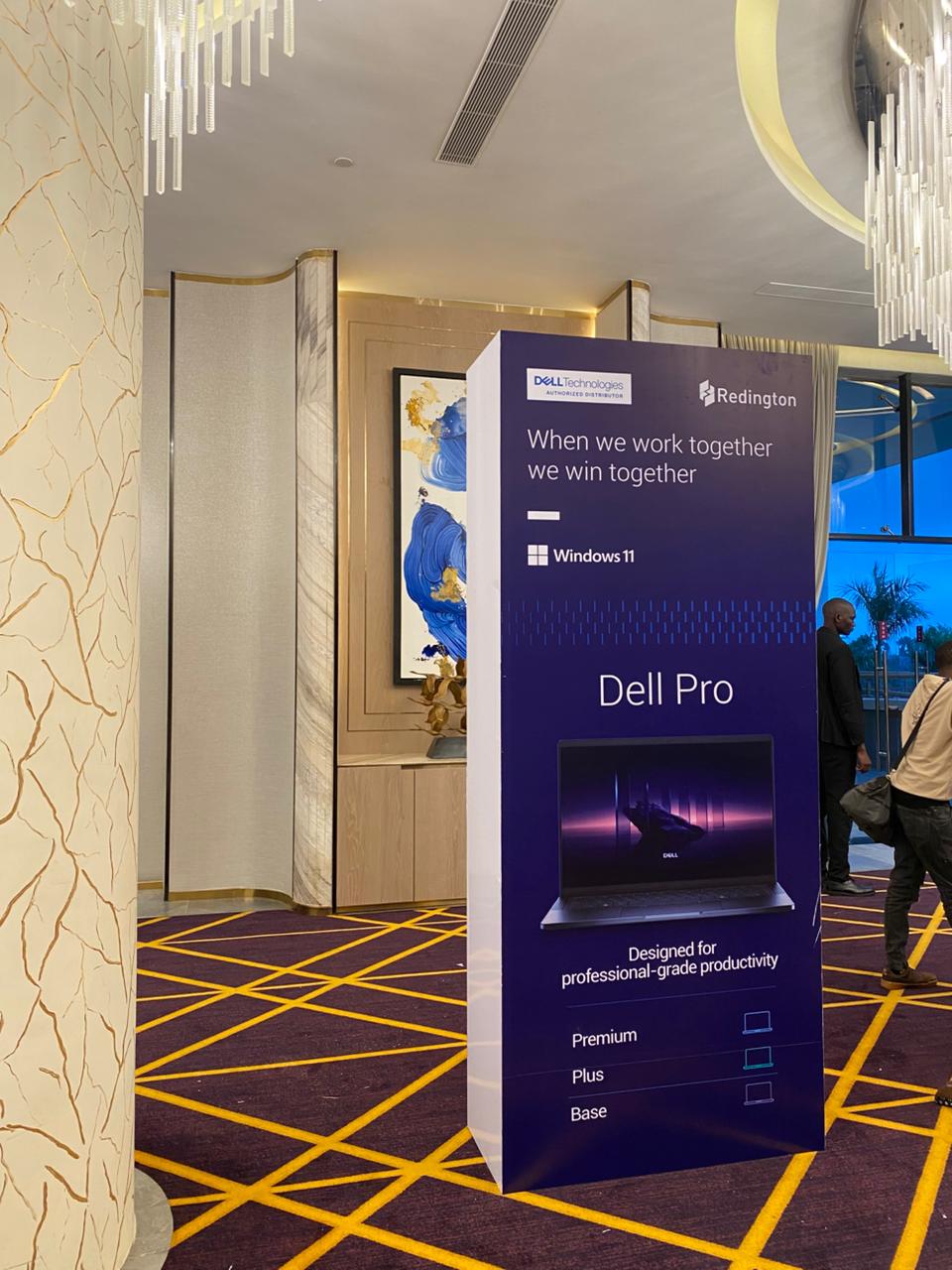
Vertical tower / pylon anchors
A single tall pylon at registration or at the stage edge does the work of ten pull-up banners. Vertical repetition of the mark builds recall without cluttering the floor.
Idea 07
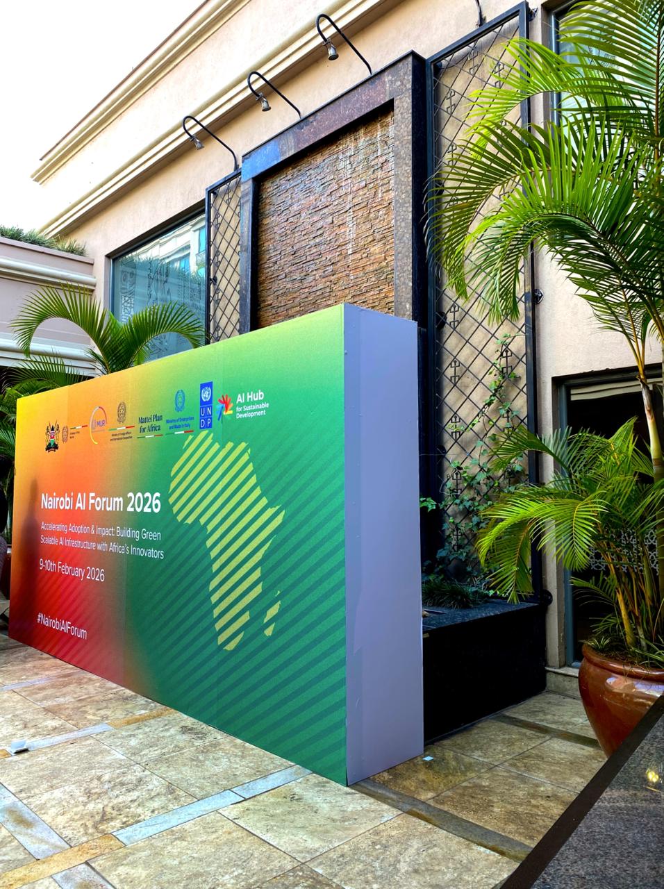
Registration as the first brand touch
Registration is a queue — use it. A branded backdrop, matching desk skirts, printed lanyards and a welcome pylon set the tone before the programme even starts.
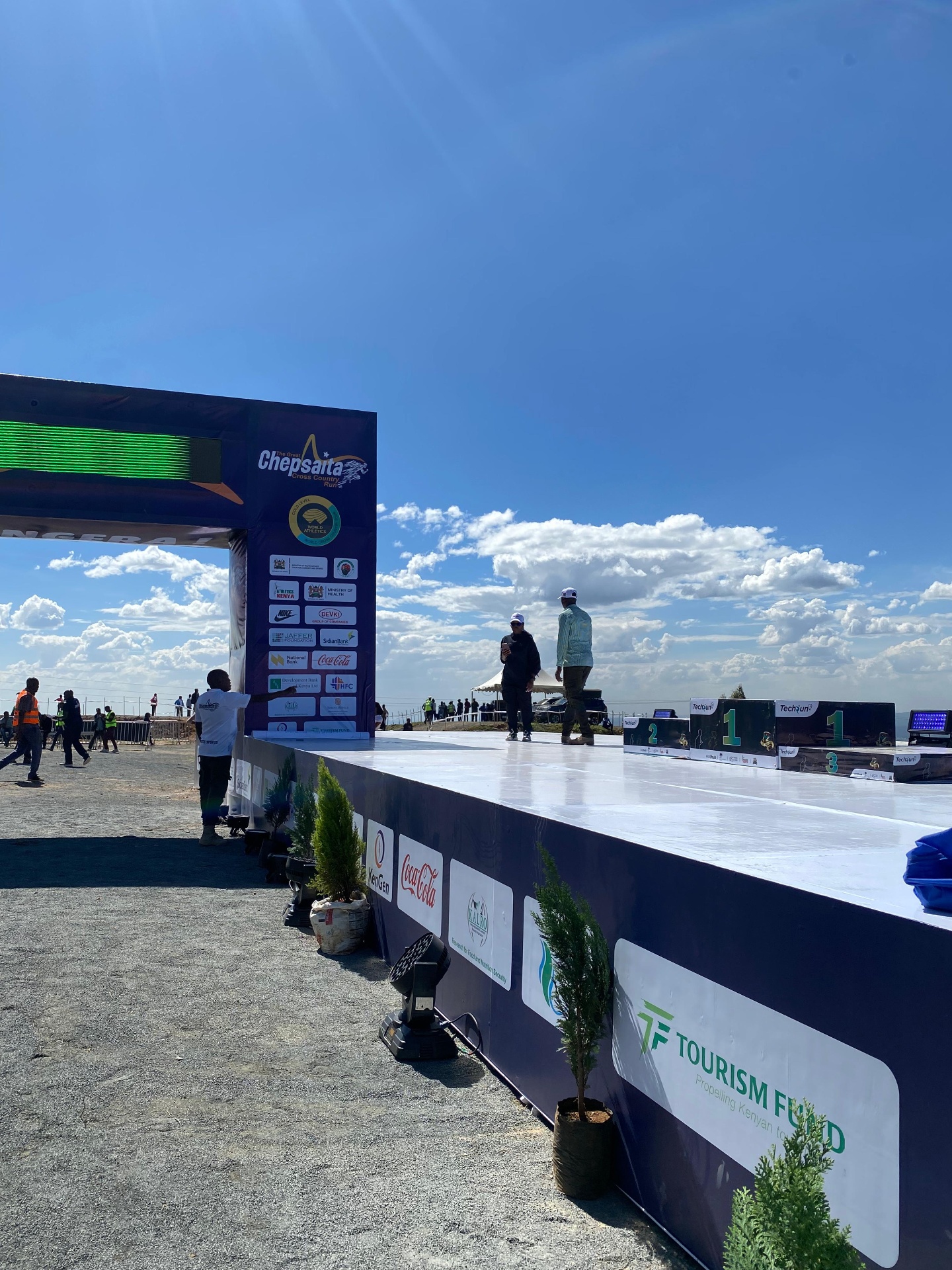
Idea 08
A podium that photographs well
Podiums live in every press photo the day after. Build them at a proportional scale, kicker + tier number on the face, sponsor row underneath, and a clean backdrop directly behind.
Idea 09
Colour ownership
Pick one accent colour and use it everywhere — lanyards, stage lighting, pylon caps, floor decals, marshal bibs. Guests remember the colour before they remember the logo.
Idea 10
Typography as a graphic
Blow the wordmark or a key phrase up until it becomes wallpaper. Oversized type on a stage wing or a corridor wall photographs harder than any illustration.
Idea 11
Consistent print collateral
Notepads, tent cards, agendas, delegate badges and menu cards printed from the same design system make the room feel curated, not assembled.
Idea 12
Live content walls
A tall printed wall that updates with the day's programme, hashtag, or leaderboard turns the identity into something living, not just decorative.
Idea 13
Lighting as a brand layer
Uplights, wash lights and gobo projections take the identity into the third dimension. Pick two lighting states — a hero look and a working look — and stick to them.
Idea 14
A photo moment on purpose
Design one deliberate photo moment — a step-and-repeat wall, an oversized logo cutout, a lit arch — and put it where the light is good. Guests do the distribution.
Idea 15
Break down as carefully as build up
The last thing people see is load-out. Design elements that come apart cleanly, protect the print faces, and travel — so the identity survives to the next activation.